
gaucha works stationary
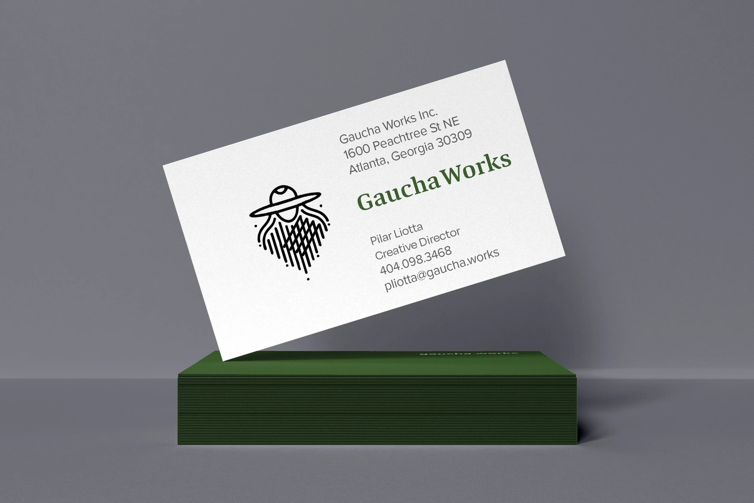
Gaucha Works was designed in my Business of Graphic Design class as a conceptual brand reflecting my identity and design philosophy. The name Gaucha comes from Gaucho, the Argentine cowboy, as a nod to my heritage, with Gaucha representing a feminine adaptation of the term. I wanted the brand to embody strength, craftsmanship, and authenticity, while the green accent color reinforces its earthy connection—symbolizing nature, tradition, and resilience, much like the Gauchos themselves. For the typography, I chose Quador Bold for its subtle rustic qualities, balancing a strong, structured look with a hint of handcrafted character. The project included a full brand identity, featuring a logo, business cards, and professional paperwork, designed to create a polished yet grounded visual presence.